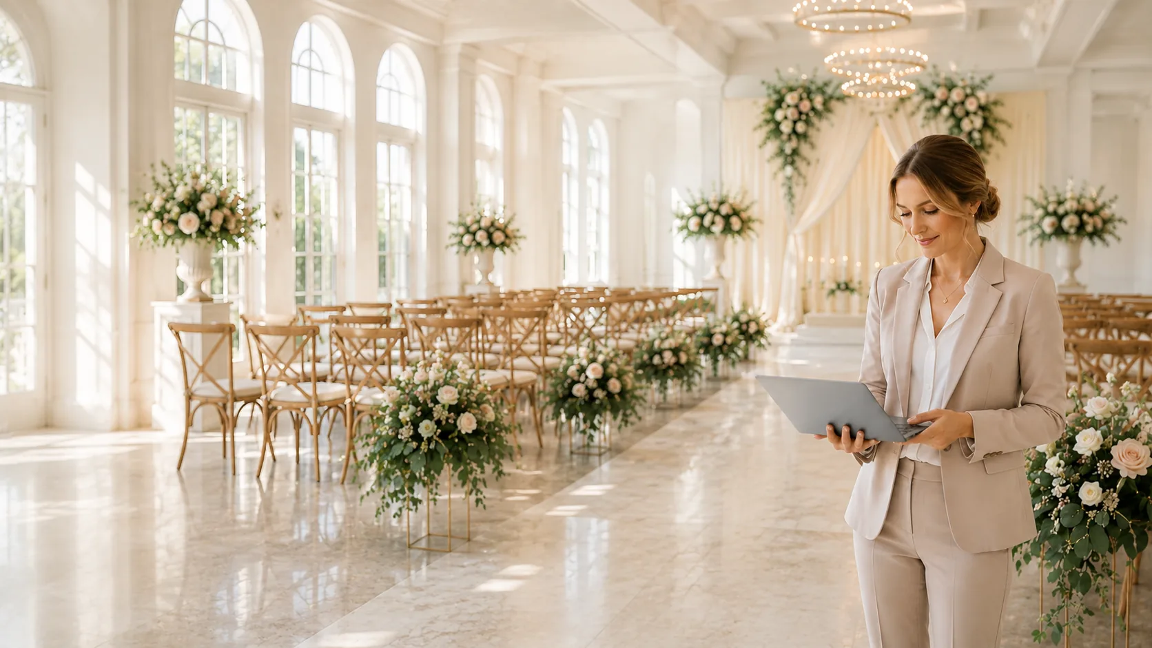
Every wedding venue goes through busy months and slow months. There are times when your inbox is full of new inquiries, and times when it feels like no one is planning anything. This up and down pattern is normal, but it can make it hard to keep your calendar full all year.
That is where a seasonal marketing plan comes in. When you market your venue with the seasons in mind, you can prepare for the slow times, take advantage of the busy ones, and make sure couples are always thinking about your venue. A seasonal plan helps you stay organized, use your budget wisely, and stay ahead of your competition.
In this post, we will explain why every wedding venue needs a seasonal marketing plan, how to create one, and what kind of content to share each season to keep inquiries coming in year-round.
What Does “Above the Fold” Mean?
In simple terms, above the fold means everything that appears on your website before someone scrolls down. Think of it as the first thing they see when they open your homepage on a phone or computer.
For wedding venues, this is your most valuable real estate. Couples are deciding in just a few seconds whether your venue feels right for them. That means every inch of space needs to work together to answer one key question:
“Is this the place where I can picture myself getting married?”
Your above-the-fold area should not try to say everything. Instead, it should say the right things clearly, beautifully, and confidently.
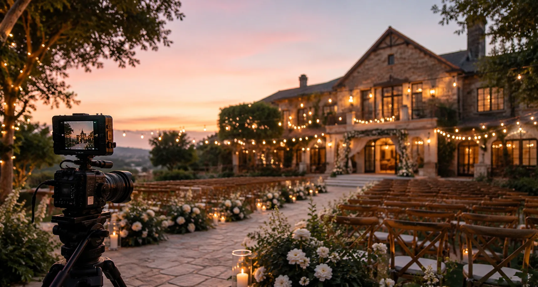
1. A Hero Image That Sparks Emotion
The first thing any visitor sees is your main photo—also called your hero image. This photo must instantly connect with emotion.
What Makes a Great Hero Image
- Show real couples, not just empty rooms.
- Capture genuine emotion, natural light, and beautiful details.
- Avoid cluttered or dark photos.
- Choose one strong image instead of a rotating slideshow (which can distract or slow your site).
Your hero photo should tell a story without words. A couple laughing under twinkle lights, a first dance in front of your grand windows, or a ceremony under an oak tree—all can trigger emotional connection.
Pro Tip: Include one photo that represents your most booked setup or your signature feature. If your venue has a stunning barn, courtyard, or waterfront view, lead with that.
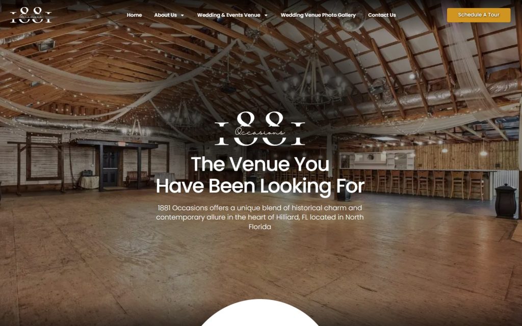
2. A Clear, Benefit-Driven Headline
Your headline is the first line of text above the fold—and it must do two things:
- Tell couples what you offer.
- Help them picture why your venue is different or better.
Avoid using only your venue name as the headline. Instead, combine it with a strong, emotional phrase.
Examples of Strong Above-the-Fold Headlines:
- “Where Timeless Romance Meets Modern Elegance.”
- “The Perfect Place to Begin Your Forever.”
- “A Hidden Gem for Unforgettable Weddings in %%Location%%.”
- “Celebrate Your Love in a Space as Unique as Your Story.”
The goal is to make couples feel something while making it clear what you offer.
Pro Tip: Keep it under two short lines so it’s easy to read on mobile screens.
3. A Subheadline That Builds Trust
Once you’ve captured attention, you need to build confidence. Your subheadline should quickly explain what makes your venue special and trustworthy.
Think of it like a mini elevator pitch that sits right below your main headline.
Examples of Effective Subheadlines:
- “Award-winning wedding venue offering full-service packages and breathtaking scenery in Your City, State”
- “From intimate gatherings to grand celebrations, we bring every love story to life.”
- “Over 250 five-star reviews from couples who fell in love with our venue.”
This small line of text helps visitors understand why they should stay and explore further.
4. A Call-to-Action Button That Feels Natural
Your call-to-action (CTA) is where the real conversion happens. Above the fold, you want to make it incredibly easy for couples to take the next step—whether that’s scheduling a tour, viewing pricing, or requesting more information.
Your button text should be friendly, clear, and action-oriented.
Examples of Strong CTA Buttons:
- “Schedule a Tour”
- “See Our Packages”
- “Check Availability”
- “Get More Information”
Avoid vague buttons like “Learn More.” You want couples to know exactly what will happen when they click.
Pro Tip: Use one main button above the fold and repeat it again below on the page. Consistency drives conversions.
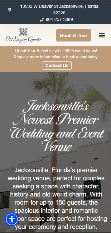
5. Your Venue Location and Quick Contact Info
Couples often leave a site when they can’t find where a venue is located. Make sure your location or service area is visible right away.
You can include a short line such as:
“Located in beautiful St. Augustine, Florida.”
Or add a clickable map icon, contact number, or “Call Us” link.
If you want couples to call instead of fill out a form, make your phone number clickable on mobile and easy to spot in your header.
Pro Tip: Many venues hide their phone number or location in the footer—don’t. Make it visible immediately.
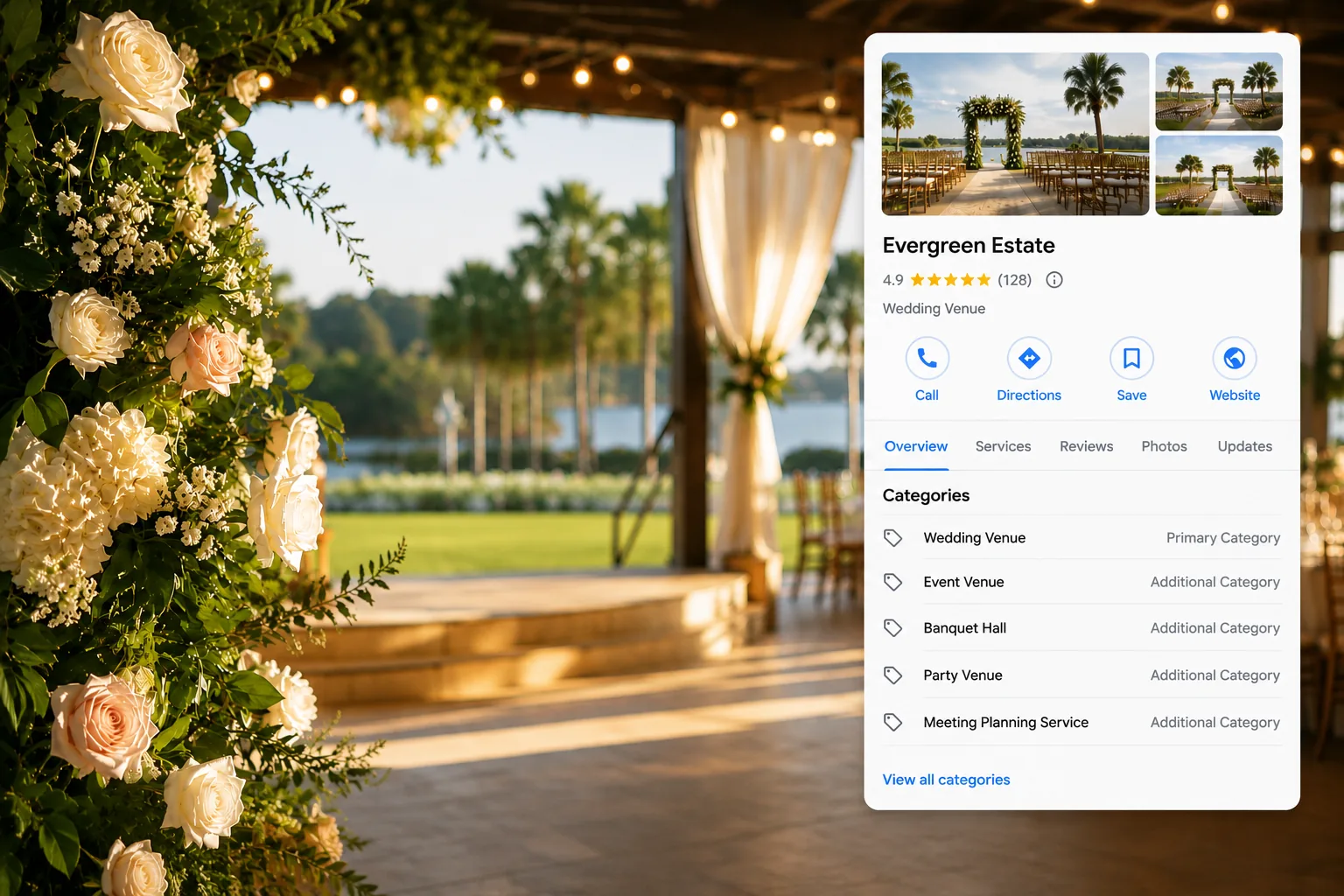
6. Social Proof That Builds Credibility Fast
In the wedding industry, trust is everything. Couples want to know that other people loved their experience before they commit to a tour.
That’s where social proof comes in. You can include small but powerful visual trust signals above the fold, such as:
- “Rated 5 Stars on Google and The Knot.”
- A line of small logos from WeddingWire, The Knot, or local awards.
- A short quote from a real review.
For example:
“The best day of our lives! The team made everything flawless from start to finish.” – Sarah & Josh
It takes up very little space but has a big impact on confidence.
7. A Simple Navigation Bar
Your navigation bar helps visitors explore your site. Above the fold, keep it simple and clear.
Limit your main menu to about five key links such as:
- Home
- Gallery
- Packages
- About
- Contact
Too many links can overwhelm couples and cause confusion. Focus on where you want them to go next.
Pro Tip: Always include your CTA (like “Book a Tour”) as a standout button in your top navigation.
8. Mobile Design That Puts Booking First
Most couples will visit your venue website on their phones. If your mobile design is cluttered or hard to read, you’ll lose leads immediately.
Make sure your hero photo looks beautiful on a phone screen, your headline fits without breaking awkwardly, and your CTA button is large enough to tap easily.
Checklist for a Strong Mobile Above-the-Fold Section:
- Loads fast (under 3 seconds).
- Text is large and readable.
- No distracting pop-ups right away.
- Clear path to call, message, or book.
You can test your mobile experience by viewing your site on your own phone and asking, “Would I know what to do in 5 seconds?”
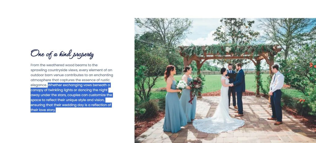
9. Emotional Messaging That Sells the Experience, Not Just the Space
One of the biggest mistakes venue websites make is focusing only on the building, not the emotion. Your copy should describe the experience couples will have, not just the features of your space.
For example, instead of:
“Our venue has 5,000 square feet of event space.”
Say:
“Celebrate with loved ones in a space designed for laughter, dancing, and unforgettable memories.”
Words create feelings—and feelings sell weddings.
10. Visual Harmony and Brand Consistency
Everything above the fold should match your brand’s tone and visual identity. Your fonts, colors, and photography style all play a role in creating the right impression.
A rustic barn venue should feel warm and inviting with natural tones and textures.
A coastal venue should feel airy, bright, and romantic.
An elegant ballroom should feel classic and luxurious.
When your visuals match your venue’s true personality, couples are more likely to feel aligned from the very first glance.
11. Avoiding Common Above-the-Fold Mistakes
Here are a few common pitfalls that hurt conversions:
- Too many slideshows or moving images that slow load times.
- Generic stock photos that do not represent your venue.
- Small, hard-to-read text on mobile.
- No clear call-to-action.
- Cluttered designs that make visitors unsure where to look.
Remember, the goal is not to show everything—it is to guide couples toward the next step with clarity and emotion.
12. Bonus Tip: Use Video Carefully
Video can be powerful if done right. A short, muted background video showing a bride walking down the aisle or a drone shot of your property can add motion and magic.
However, if it slows your site down or distracts from your call-to-action, skip it. Always test your website speed before publishing video headers.
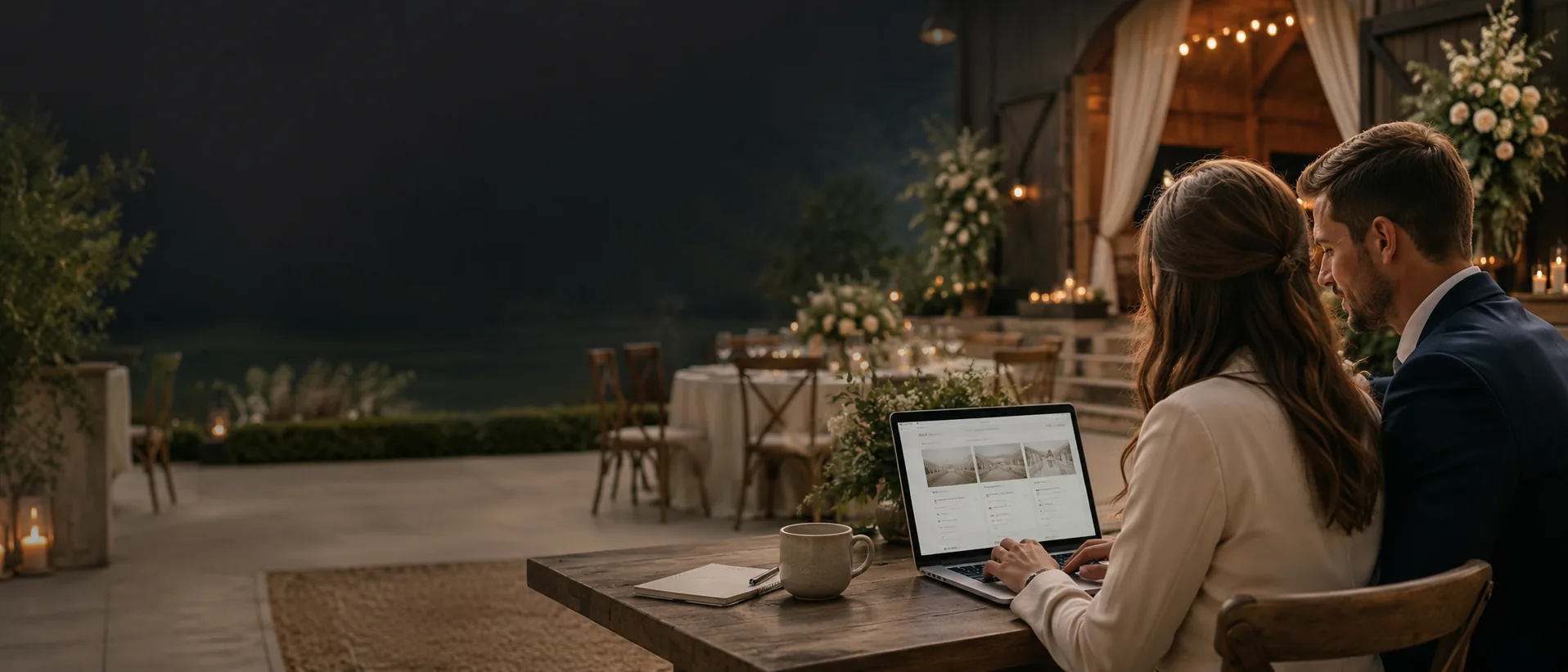
How to Test and Improve Your Above-the-Fold Design
Once your site looks great, don’t stop there. Small changes can have big results.
Here’s how to test and improve:
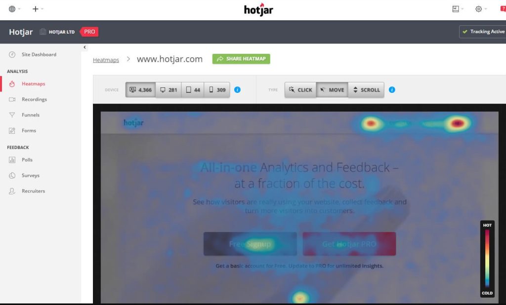
- Heatmaps: Tools like Hotjar show where people click and scroll.
- A/B Testing: Try two different hero photos or headlines and see which gets more form submissions.
- Feedback: Ask recent couples or planners how your site feels when they first land on it.
When you review data regularly, you’ll discover small tweaks that lead to more inquiries and better engagement.
The Psychology Behind First Impressions
When a couple lands on your homepage, they are subconsciously scanning for three things:
- Can I picture myself here?
- Can I trust this place?
- What do I do next?
If your above-the-fold area answers those questions within seconds, your conversion rate will skyrocket.
Everything from your photo choice to your button color contributes to that quick decision.
Turning Visitors Into Booked Tours
The goal of your website is not just to impress, it is to convert.
When your above-the-fold design combines emotional imagery, clear headlines, and an easy call-to-action, you create a direct path from visitor to booked tour.
Even if couples are exploring multiple venues, yours will stand out because your website makes it easy to imagine their day there.
Closing Thoughts: Make Your First Impression Count
Your wedding venue website is not just an online brochure, it is your most powerful sales tool.
Every couple who visits is giving you a few seconds of their attention. Above the fold, you have the chance to capture their hearts, build trust, and guide them toward booking a tour.
If your website is not converting as well as you would like, start by reworking that top section. Often, improving just your hero photo, headline, and call-to-action can make a dramatic difference.
Let Dual Spark Marketing Help You Design a Website That Books More Weddings
At Dual Spark Marketing, we build custom wedding venue websites that not only look stunning but are built to convert visitors into booked tours.
We understand what drives couples to click, call, and say “yes” to your venue. From emotional design to strategic layout, our team knows how to craft above-the-fold experiences that turn interest into action.
Schedule a free 15-minute call today at 904-907-0792 to review your current website and discover how we can help you turn more visitors into weddings.
Your venue deserves a website that works as hard as you do. Let’s make that happen.